Visualizations

I primarily use R (ggplot2 and related packages) for the creation of visualizations, particularly drafting them prior to creating interactive versions. This ensures the visualization has a clear takeaway and that I can easily make transformations and changes to data. Then, I'll use Datawrapper, Flourish, or another interactive tool depending on where the visualization will be hosted, what styling capabilities I want, and other preferences.

Here are some examples of visualizations I've made for various purposes and audiences over the past few years.
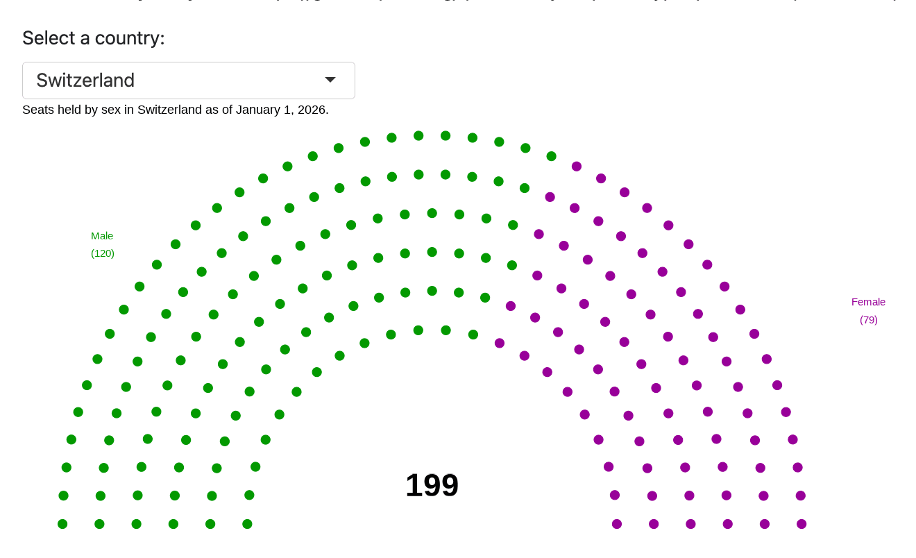
Gender composition of Switzerland's legislature.
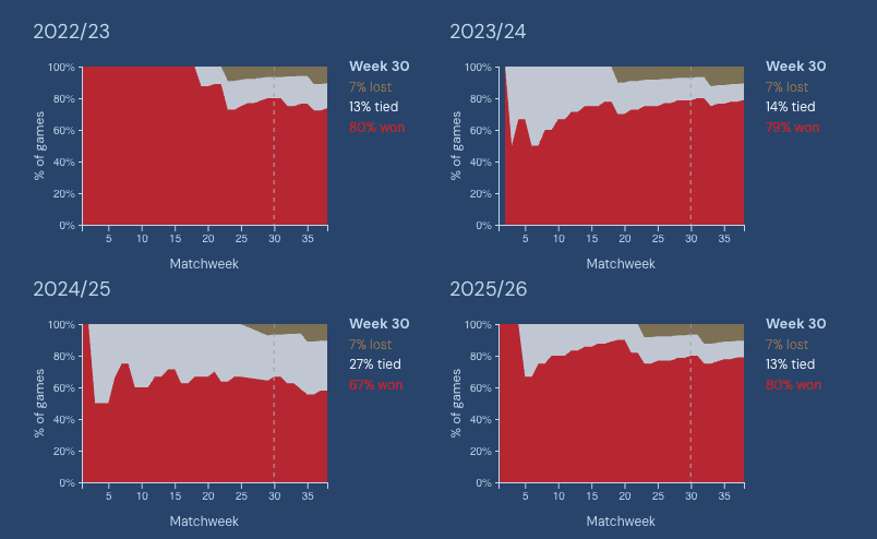
Arsenal's win percentage over the past 4 Premier League seasons
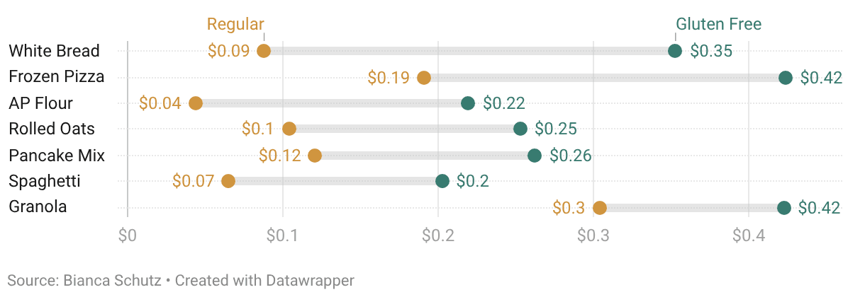
Average difference in GF vs normal grocery prices
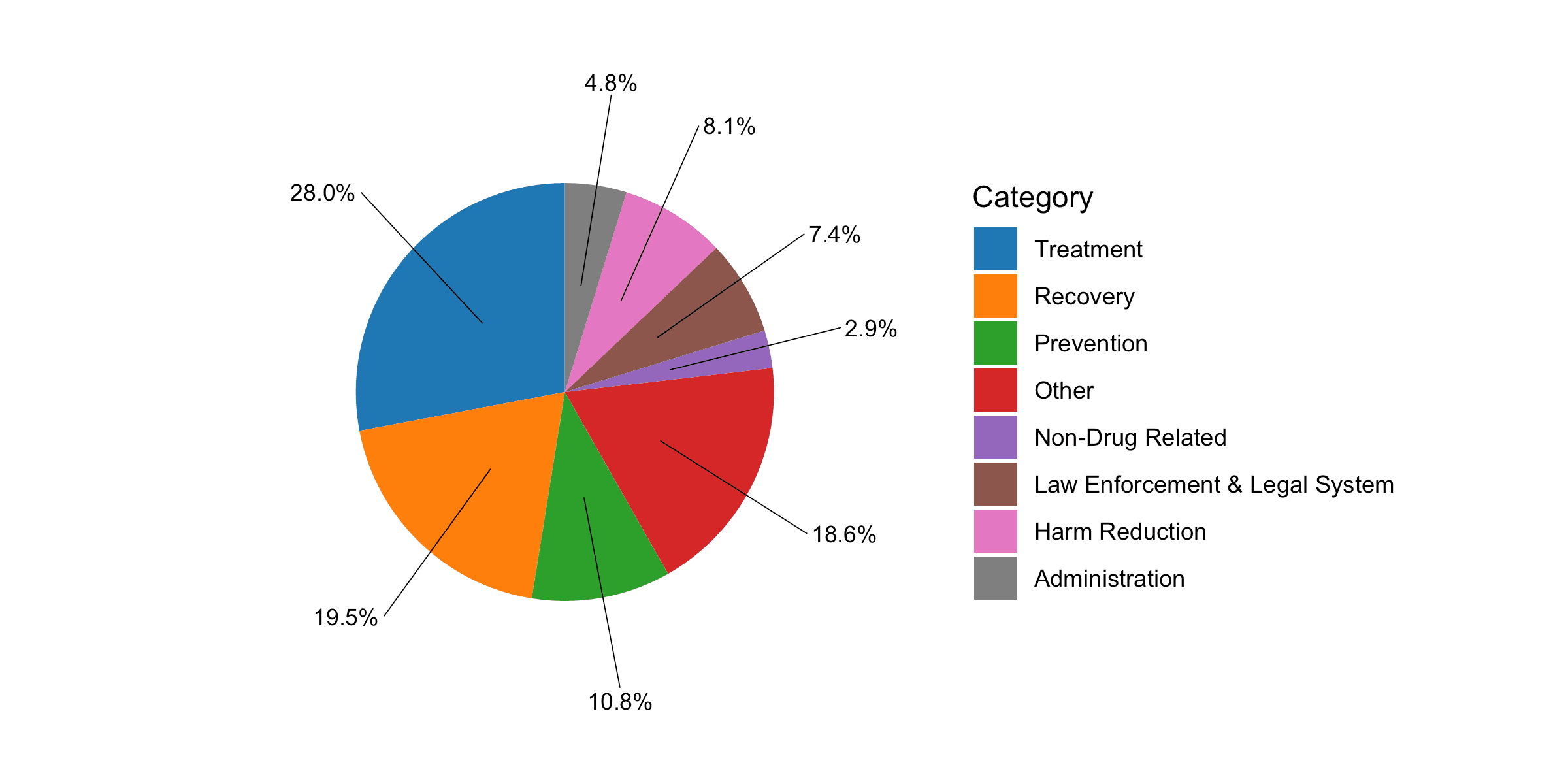
Distribution of opioid settlement expenditures
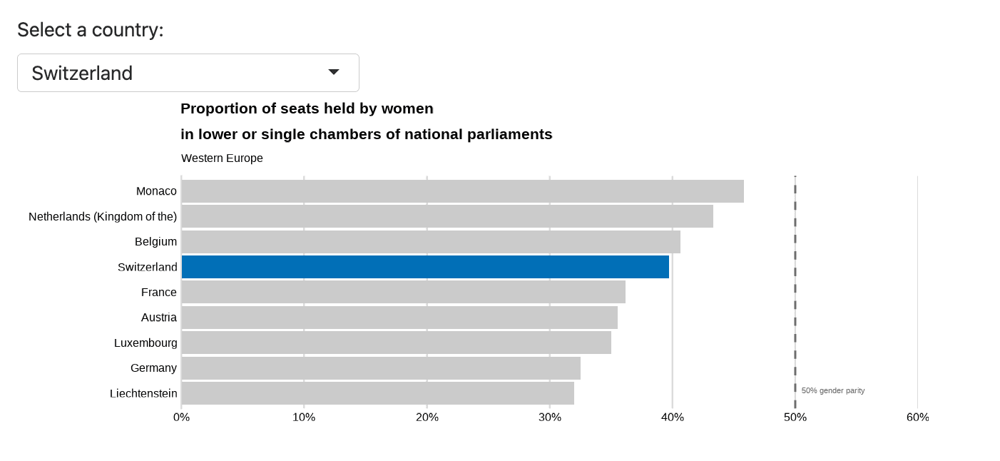
How Switzerland stacks up to Western Europe in descriptive representation in parliament
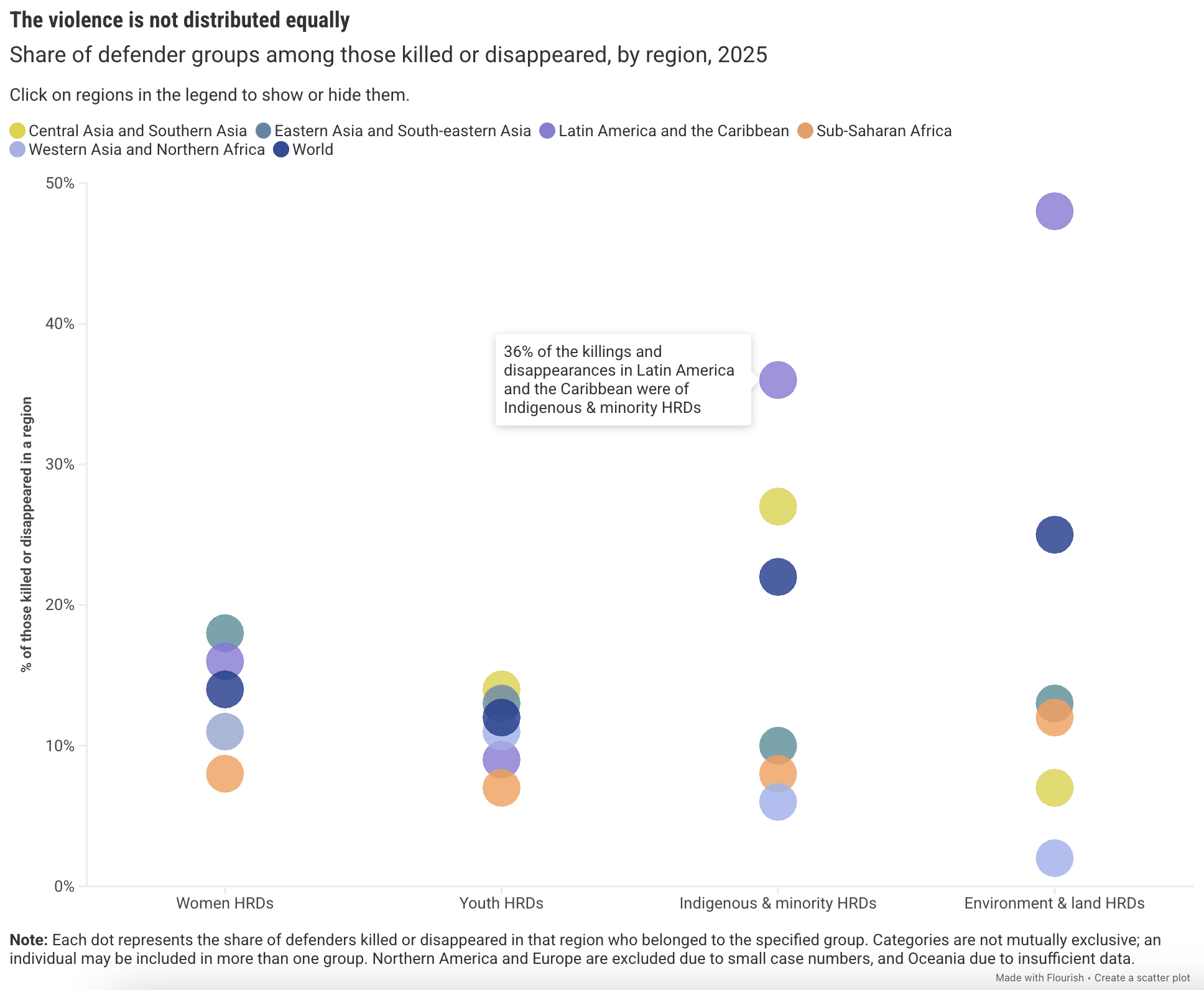
Attacks against human rights defenders by category and region
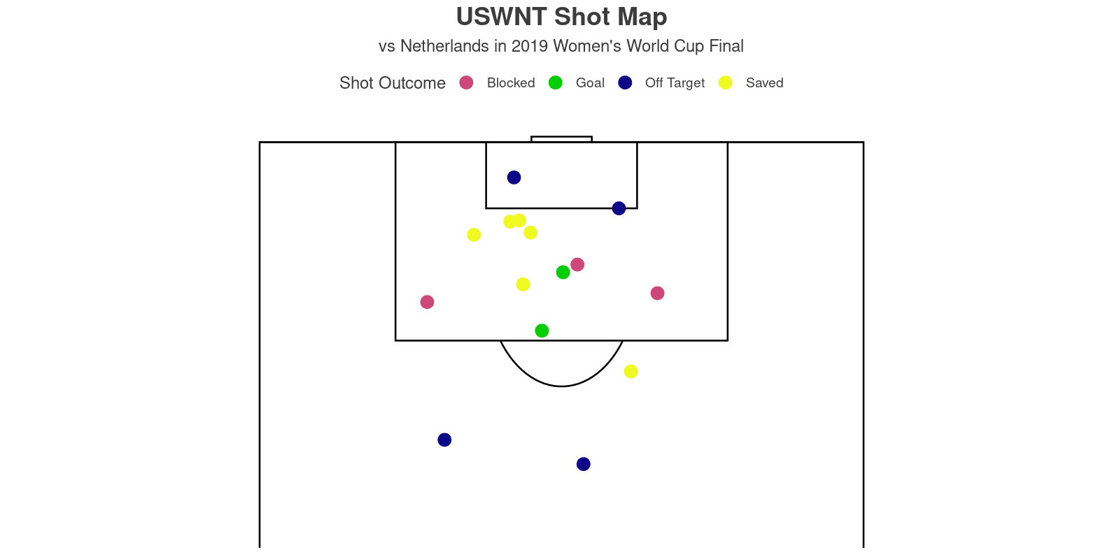
US women's national football team shot map
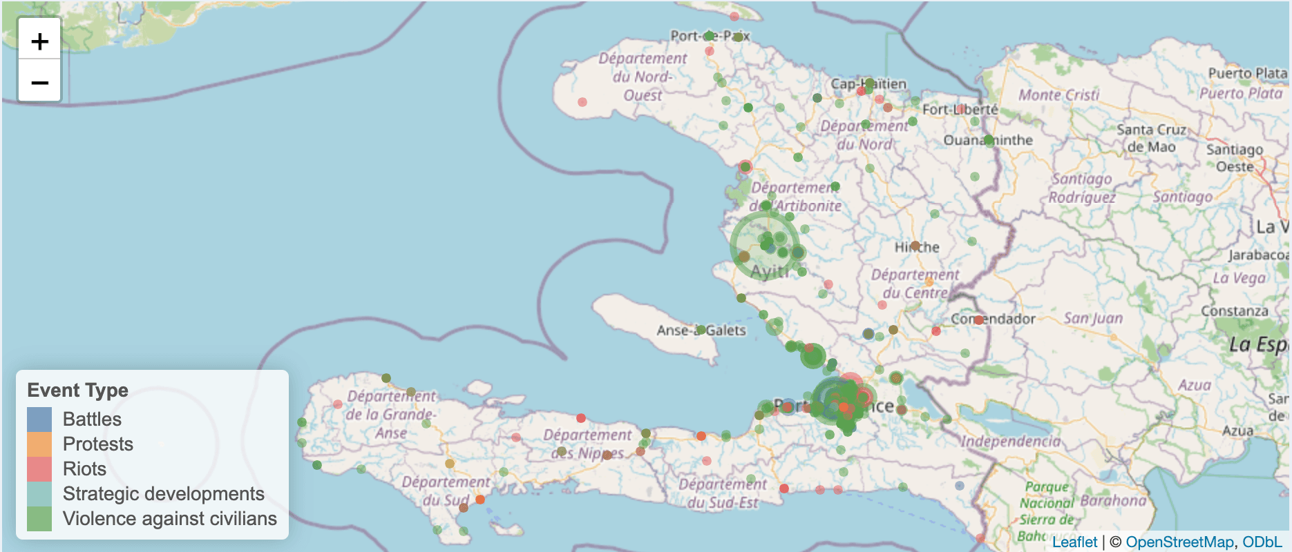
Civilian casualties in Haiti
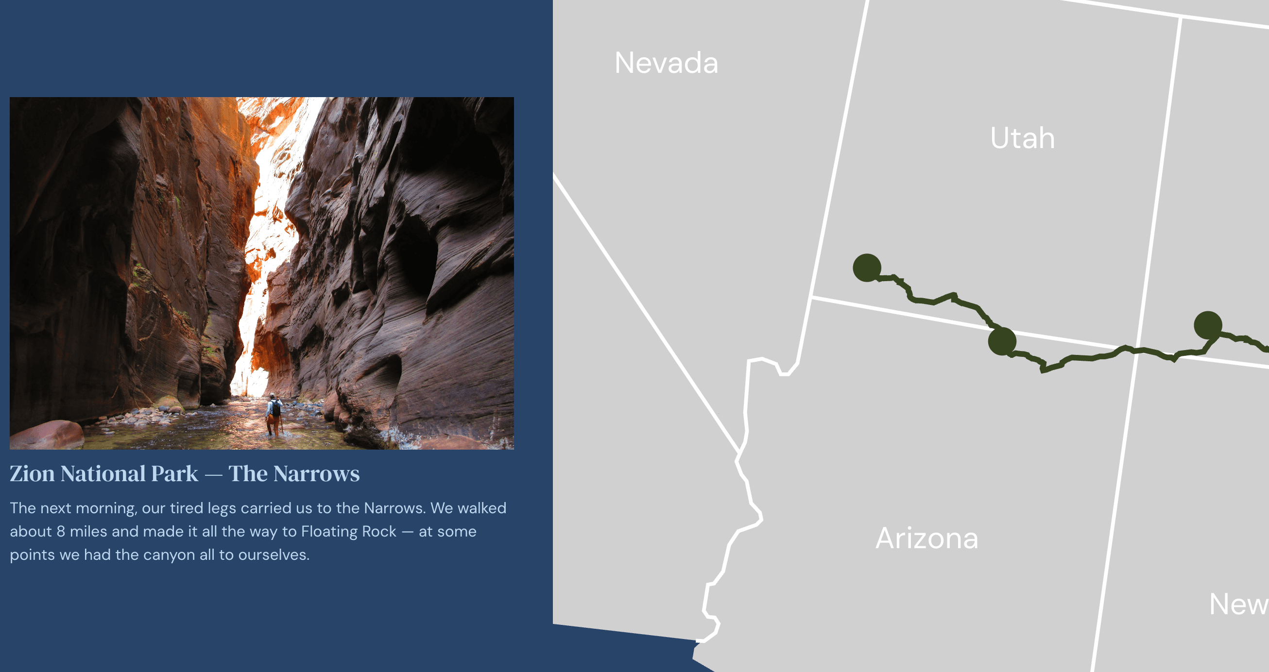
"Scrolly" map of a national parks roadtrip
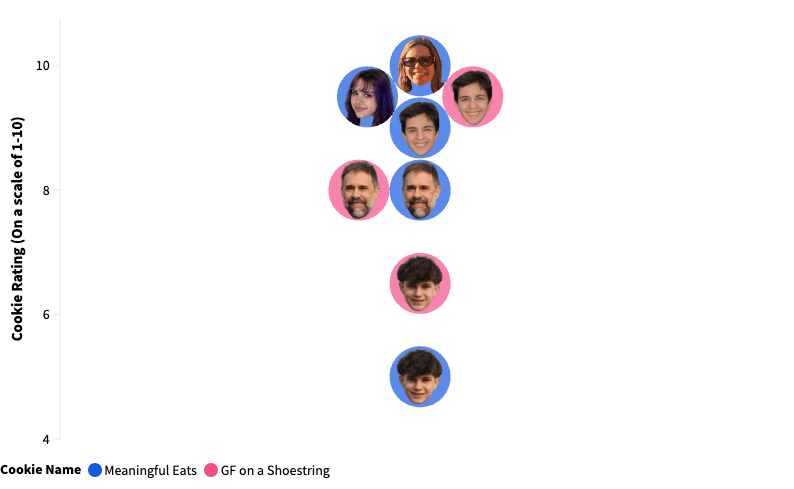
Finding the best gluten-free chocolate chip cookie recipe
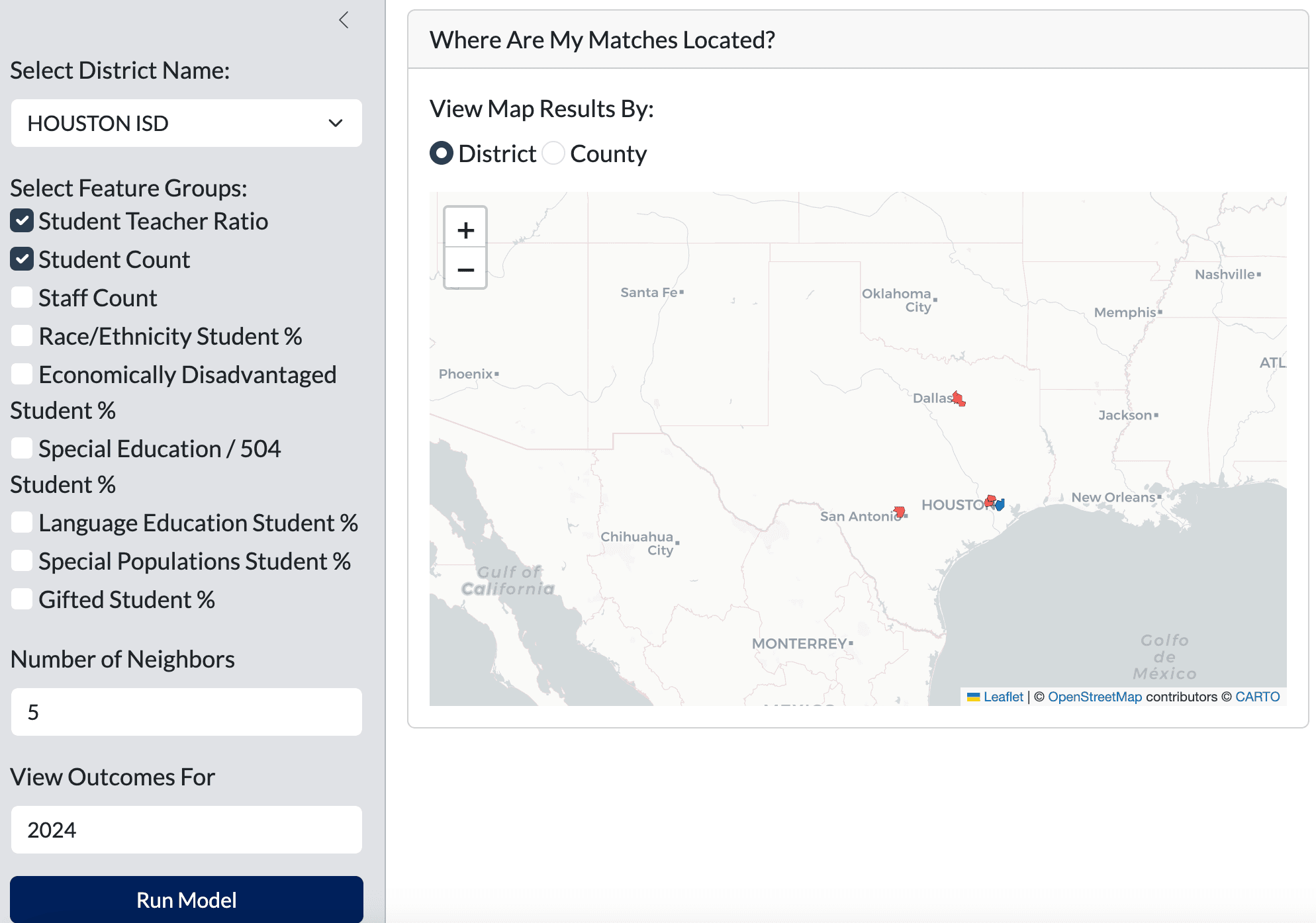
Mapping nearest neighbors for Texas school districts
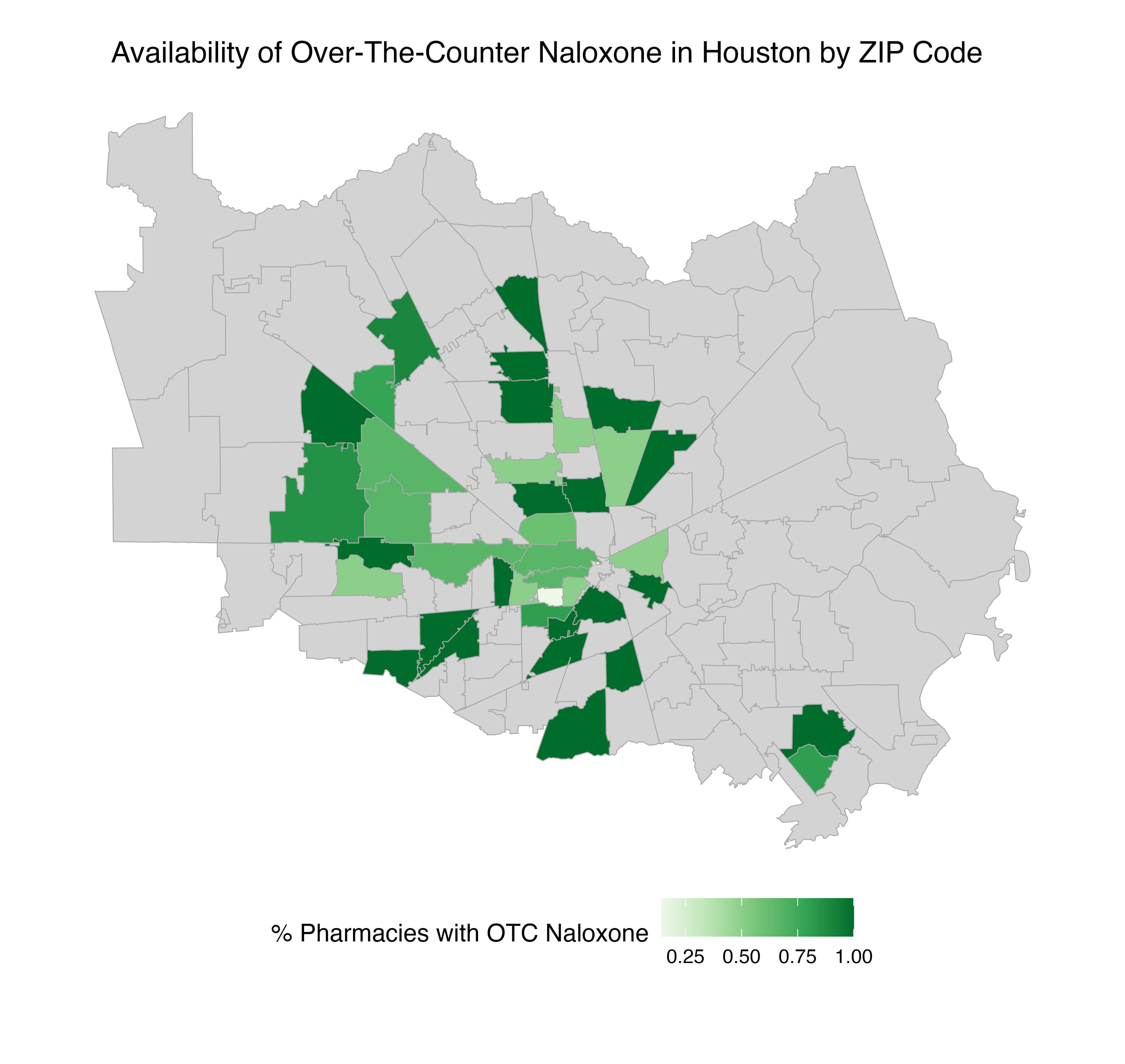
Availability of OTC naloxone in Houston, Texas